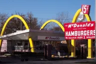
Few things are more iconic than the McDonald's golden arches. No matter what country you're in, chances are high that you could spot this iconic logo from a mile away. No matter if it's an American interstate or a busy city block in Japan, this American brand has truly taken over the globe from the first burger stand in San Bernardino California. However, there's something quite interesting lurking in the imagery of McDonald's logo and it all comes down to the letter M, or those golden arches.
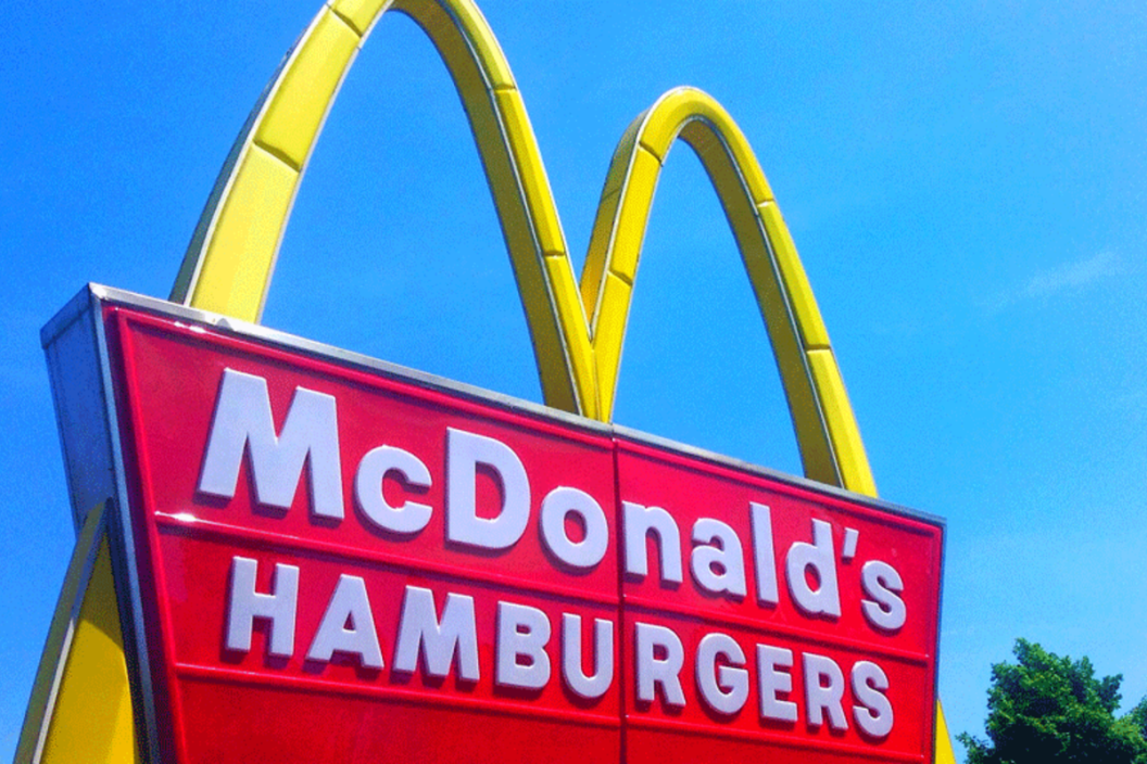
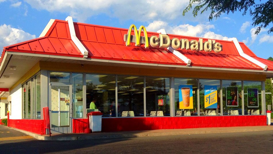
First, let's just take a look at the McDonald's restaurant logo. You know, to make sure we're all on the same page.
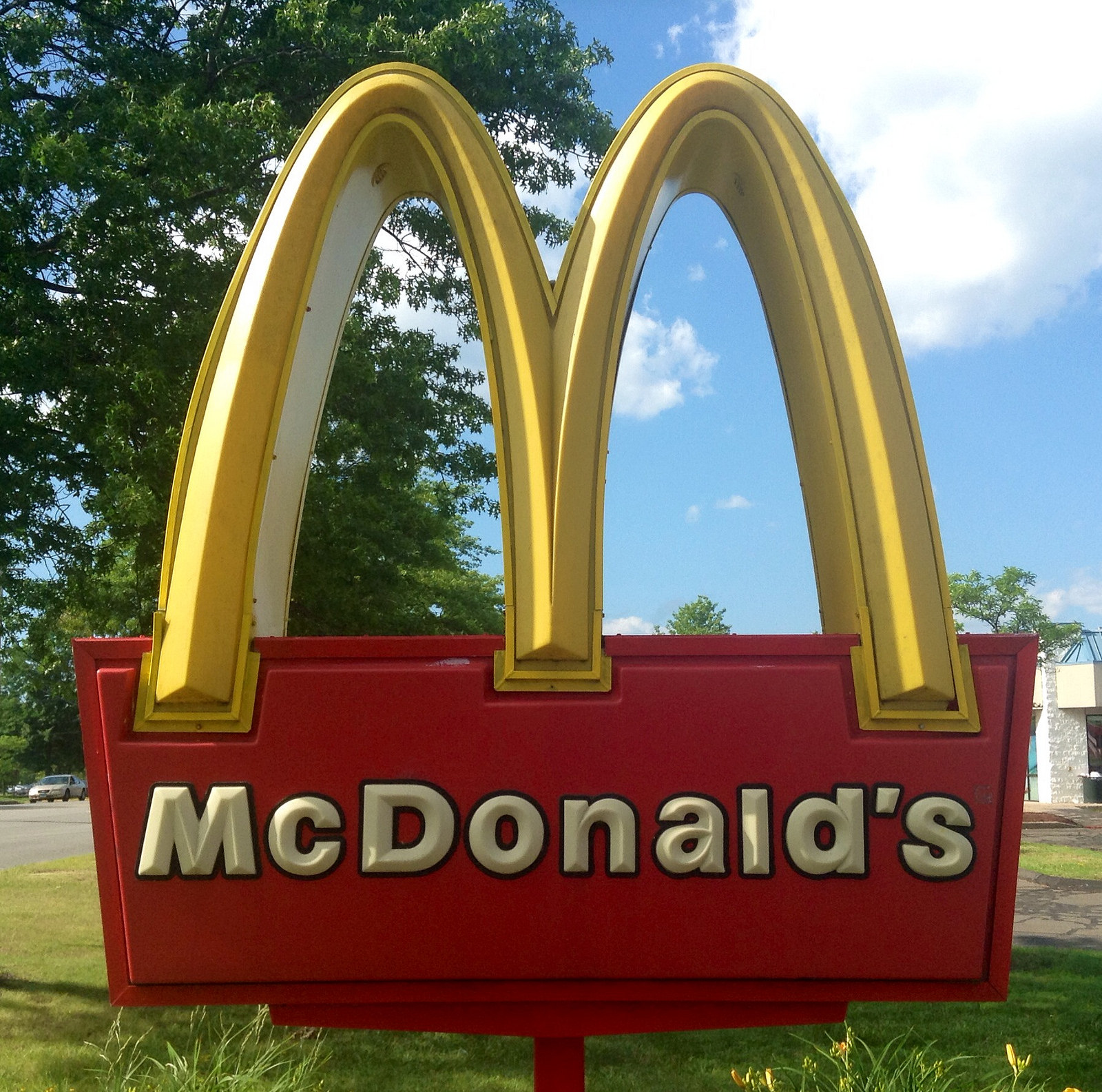
The M is iconic now, but it wasn't always so. In a report from BBC, it turns out that there's a very specific reason for that rounded M of this iconic fast food restaurant chain and it has to do with attracting the kiddos from a very young age. In the 1960s, the McDonald's corporation was ready to toss this specific McDonald's sign in the trash and start with a new logo after feeling that it wasn't on brand anymore.
However, when the McDonald brothers spoke to Louis Cheskin, a design consultant and psychologist, he urged the company to keep the current logo of the golden arches with a rounded M. Why? Because according to Cheskin, the logo, when flipped upside down, was a Freudian symbol of nourishing breasts.
Nike, Coca-Cola, and many other brands have subliminal meaning behind their logos, but few are as provocative as mother McDonald's breasts.
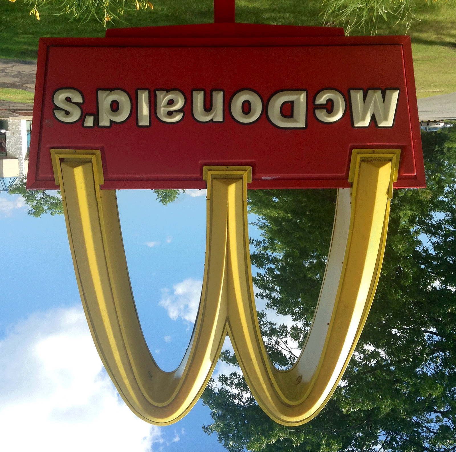
Can you see it? Of course, it's more of a subliminal message than one easily spotted, but now that you see it, you might never un-see it.
Market research performed on customers of franchisees found that children can recognize a brand logo before they can often recognize their own name and when you consider just how abundant McDonald's is in the U.S. suburbs and highway systems, it makes sense that they would want to drive home their kid-friendly branding.
The next time you get a Big Mac with French fries from the McDonald's drive in, take a long look at those arches.
After the company decided to keep the golden arches logo, Ray Kroc, the founder of the restaurant chain, would take out the company plane and fly over the highway system to spot good road junctions for the next McDonald's location. Kroc also used church steeples as his guide because he wanted to attract church-going families, and according to the BBC report, "surveys have shown that the golden arches are better known than the Christian cross."
These church-going families, too, had an awful lot of children for Kroc to entice with Happy Meals, the toys and all. Think it's just the logo that is aimed at children? Think again.
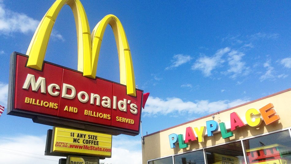
The playground colors of McDonald's are often bright and primary colors, and the Ronald McDonald clown image is meant to be a friendly, fun mascot.
So does the logo work? According to BBC, "psychologists [have confirmed] a theory that Ray Kroc and Walt Disney traded upon, that 'brand loyalty' can be established by the age of two." Have we all been duped by McDonald's? Probably.
This post was originally published on June 18, 2019.