The Atlanta Falcons had to rethink their new profile picture. The NFL franchise found itself dealing with a significant amount of criticism after sharing a new spin on a throwback logo on social media.
"The logo - posted by the Falcons on the NFL team's social media channels - shows the team's old falcon symbol from the 1960s and 1970s, emblazoned on a background of red, white and black stripes," The Guardian reported.
Sounds harmless, right?
Unfortunately not.
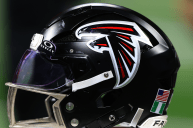
The logo has drawn comparisons to an image that was linked with Nazi Germany. As such, fans have been quick to berate the design. For reference, the Falcons logo is being compared to the World War II German eagle logo. The Falcons had originally updated their social media handles with the throwback logo, but have since switched back to their usual red helmet with a falcon on it.
Too little, too late, though. By the time the franchise had changed its social media logo, fans were already out in droves, sharing criticisms, cracking jokes, and of course, airing their dismay at such a poor choice in artwork to begin with.
From the moment the Falcons posted their throwback logo, fans began chiming in.
"Falcons are showing blitzkrieg," one user wrote.
Another user followed a similar World War II reference by noting that "Falcons were up 28-3 at Dunkirk."
"This is giving me WW2 vibes," a fan noted.
The theme continued as more and more fans piled on.
"I must say, I was not expecting to wake up this morning to see that the Atlanta Falcons are preparing to invade Poland," another fan wrote.
Other fans simply opted to crack jokes.
"Even the Hawk looks surprised by the choice," one fan noted of the falcon in the new logo.
"How on EARTH did this get through approvals?" a user on X questioned, before joking that: "Guys are calling it the Bird Reich."
"Ummmm...someone is going to be fired," another user chimed in.
The Falcons undoubtedly endured a PR nightmare with the release of this throwback logo on social media. It's hard to envision them moving forward with that design now, either for social media or in a broader sense. As such, they'll either go back to the drawing board (literally) to come up with new concepts, or opt to keep their tried and trusted logo moving forward. Either way, it can't get much worse than the one they posted to social media.