The Tax Foundation published an updated map of what $100 buys you in each state.
Most people know that cost of living varies from state to state, but how do you quantify that? Well, the folks at The Tax Foundation came up with an easy visual aid.
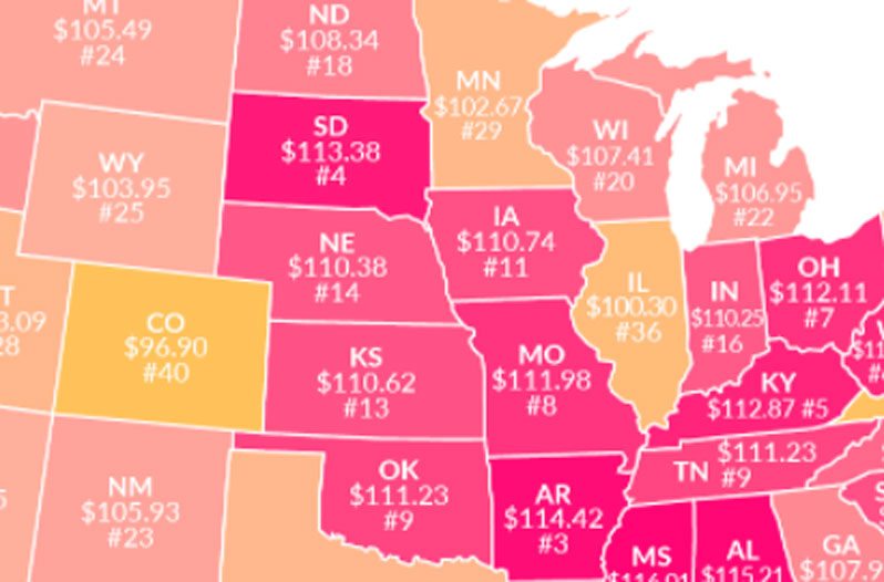
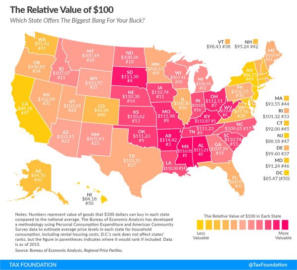
This map is a color-coded representation of what $100 is worth from state to state. Places where $100 is worth more are dark pink. The light pink to light orange shaded states indicate a lower purchasing power.
The Tax Foundation is a nonprofit tax research organization, and this is the second year they've published this information on a handy map.
A quick glance at the map will tell you that the American dollar goes a lot further in the midwest and the south than it does pretty much anywhere else.
Hawaii tops the list of most expensive states in the U.S. for the second year in a row. In Hawaii, you can buy $84.18 worth of what the national average would buy you.
At $100.30, Illinois is the closest state to being on target, only thirty cents off from $100.
Taking the prize for the biggest bang for your $100 bucks (for the second year in a row) is Mississippi. In the Magnolia State $100 will buy you the equivalent of $116.01. Congrats, Mississippi, you're about 16% richer than you thought you were.
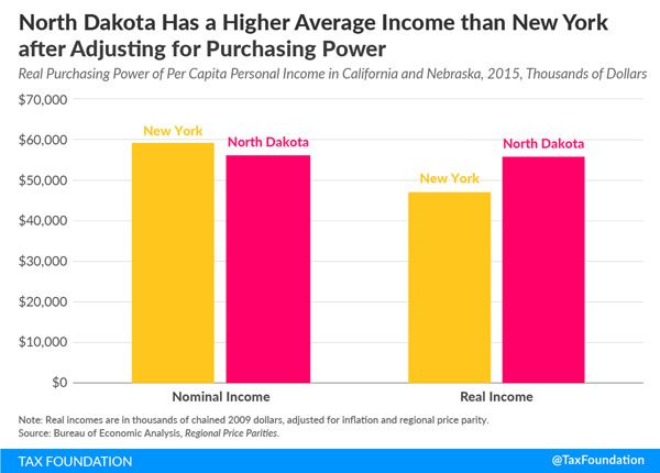
However, that's not all there is to know about this topic. Income usually offsets purchasing power, so for example, in orange states like New York, wages are higher to compensate for how expensive it is to live there.
The Tax Foundation took this into consideration as well. They learned that between two states with comparable incomes (New York and North Dakota) the higher purchasing power in North Dakota means North Dakotans can buy more with their money than New Yorkers can with theirs.